A Guide to Choosing and Approving Embroidery Colors
When ordering custom embroidery, selecting the right thread color is one of the most important steps in the production process.
At JB Screen Printing & Embroidery, we work with customers throughout New York City on custom apparel, corporate uniforms, promotional merchandise, and specialty embroidery projects.
One of the most common questions we encounter involves matching embroidery thread to a customer's desired color.
While Pantone references, digital mockups, and photographs are helpful tools, they don't always represent exactly how a color will appear when embroidered onto fabric.
Understanding these differences before production can help prevent misunderstandings and ensure that customers make informed color decisions.
1. A Pantone Color Is Not the Same as Embroidery Thread
Pantone colors are standardized references commonly used in graphic design, printing, and brand identity.
Embroidery thread is a physical material with its own color characteristics, texture, sheen, and available shades.
For example, a customer may provide a Pantone reference described as purple or plum. However, the closest available embroidery thread may appear lighter, darker, warmer, or cooler than the customer's expectations.
Unlike printed ink, embroidery thread reflects light differently depending on the thread material, stitching direction, surrounding fabric, and viewing conditions.
Even when using a manufacturer's color-conversion guide, an exact match may not be available.
A Pantone reference is an important starting point, but physical thread selection and approval provide greater clarity.
The Limitations of Pantone Matching in Embroidery
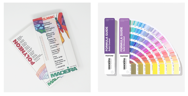
Madeira USA, a leading manufacturer of professional embroidery threads, provides a Pantone color-matching reference to help customers identify embroidery thread colors that correspond to established Pantone specifications.
However, Madeira acknowledges an important limitation: because the Pantone Matching System contains thousands of colors while embroidery thread collections offer a more limited selection, an exact Pantone-authorized thread match may not always exist.
In these situations, the closest available thread color may be recommended instead.
Madeira also cautions that colors displayed digitally are computer simulations and may not accurately reproduce established Pantone color standards.
These limitations reinforce an important distinction for custom embroidery customers: a Pantone reference helps guide thread selection, but it does not guarantee that an identical physical embroidery thread exists.
For additional information, customers can consult Madeira USA's official Pantone Color Match system.
2. Why Color Descriptions Can Be Misleading
Consider the following colors:
- Plum
- Lavender
- Light Pink
- Maroon
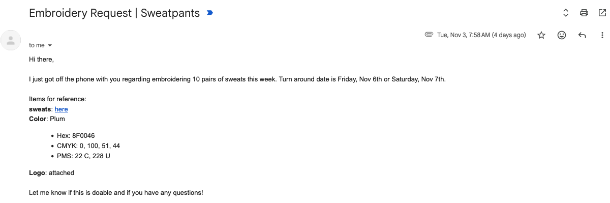
In this project, the customer's original email correspondence specified Pantone PMS 228 U and requested the color be plum. Those were the references provided to JB before production. Light pink and maroon were not specified as requested colors at that time.
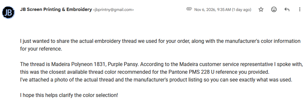
Working from the documented Pantone reference, JB selected Madeira Polyneon 1831, Purple Pansy, following guidance from Madeira. The manufacturer's designation for thread 1831 is Purple Pansy, not lavender.
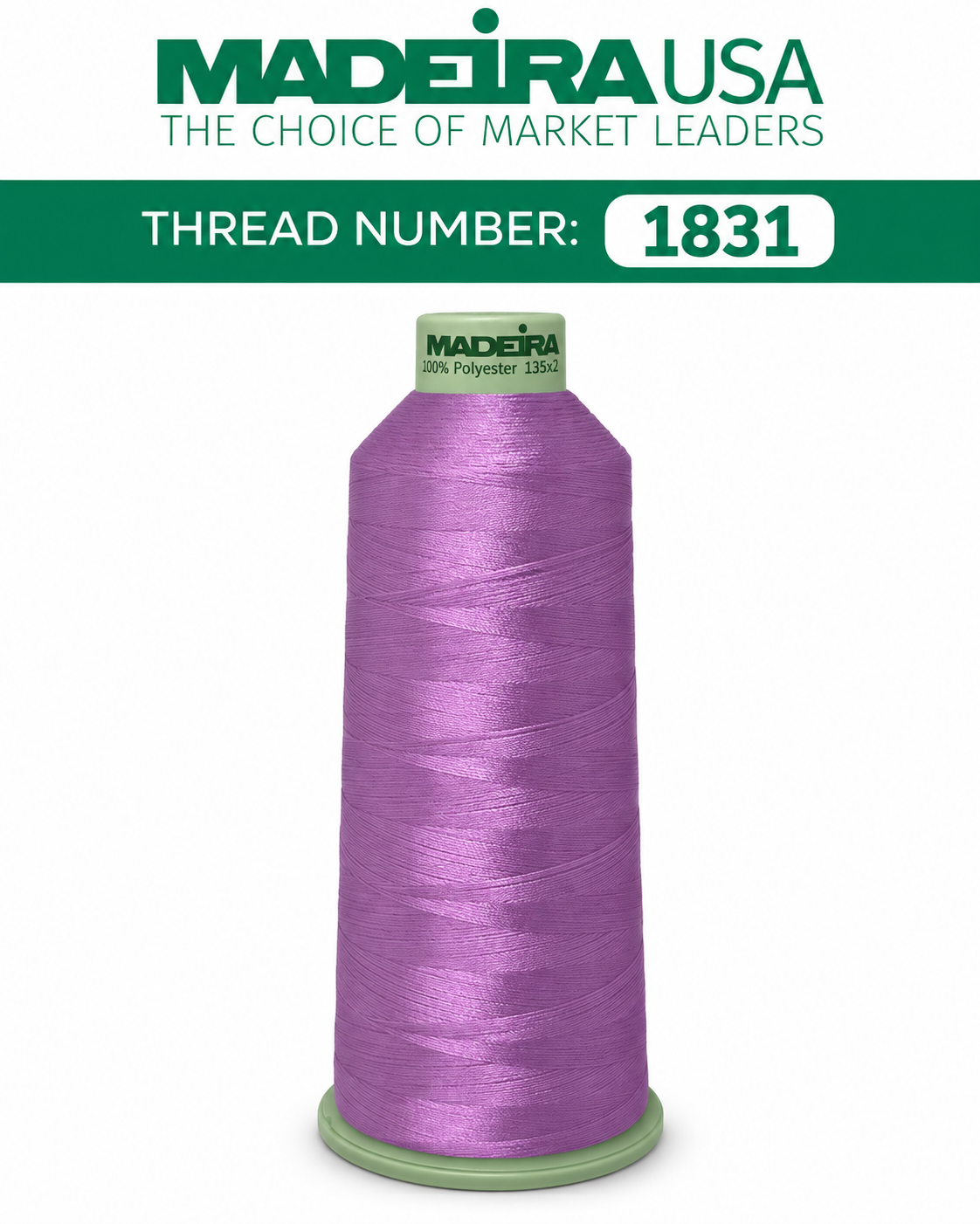
Madeira 1831 — Reference "Graphic"
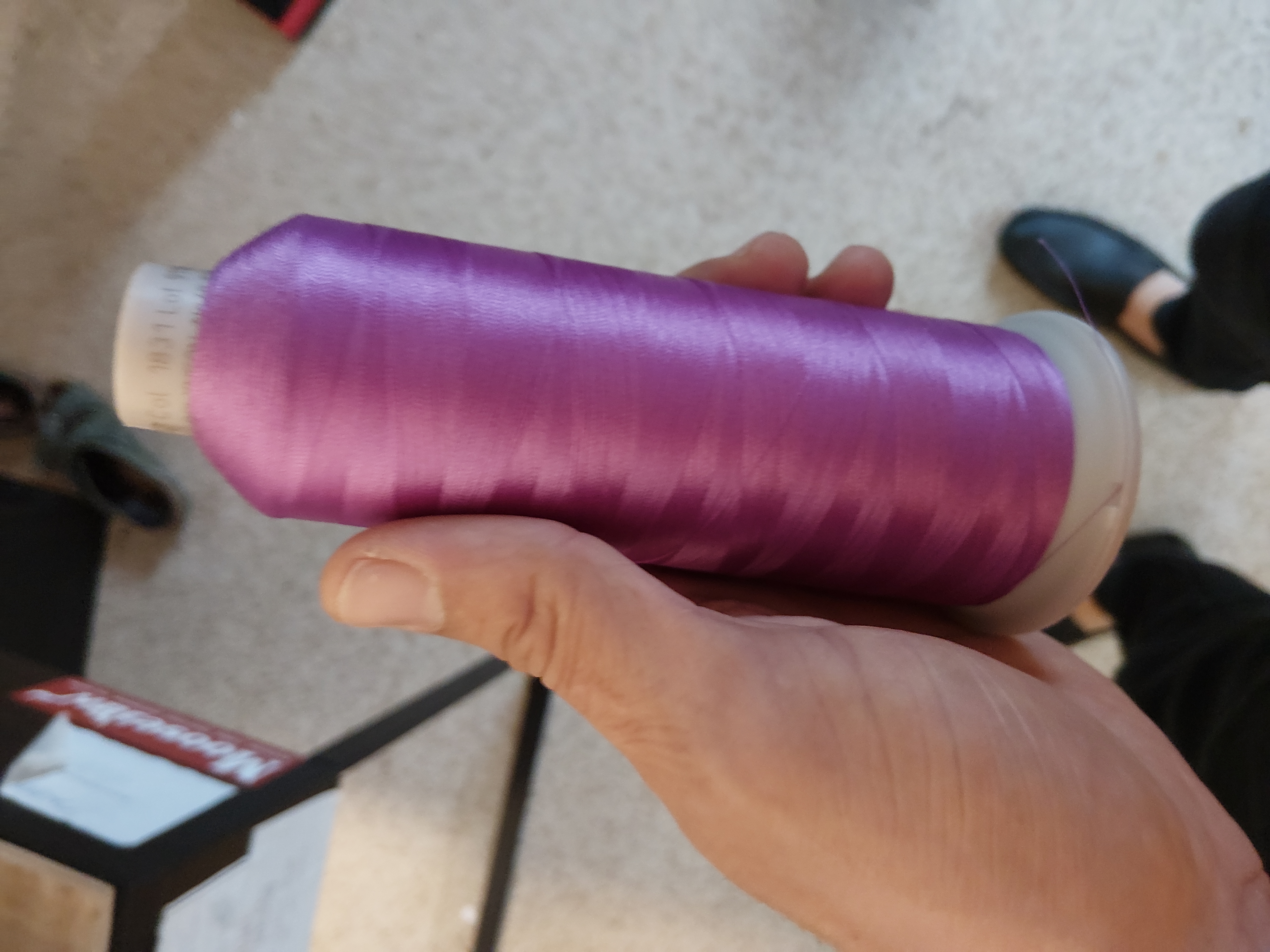
JB — "Actual" 1831 Thread Photograph IRL
Production Mockup, Stitch-Out, and First-Garment Review
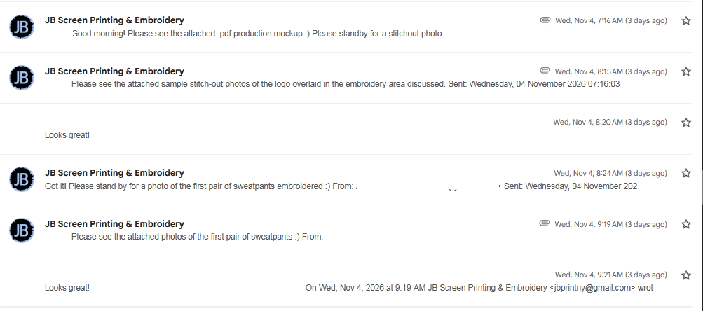
Before the later color concerns were raised, JB shared the project at three stages: first, a PDF production mockup; second, photographs of a sample embroidery stitch-out on twill fabric; and third, photographs of the first pair of sweatpants embroidered using Madeira Polyneon 1831.
The correspondence shows that after receiving the stitch-out photographs, the customer replied, “Looks great!” After JB sent photographs of the first embroidered pair of sweatpants, the customer again replied, “Looks great!”
These responses are relevant because the customer reviewed photographic examples during production before subsequently describing the completed embroidery differently. Photographs are useful review tools, although they cannot guarantee that a physical thread color will appear identical in person or on every screen.
Privacy note: Customer names, logos, email addresses, and identifying information have been removed or anonymized from the correspondence shown. This example is intended to explain the color-selection and production review process, not to identify or embarrass the customer.
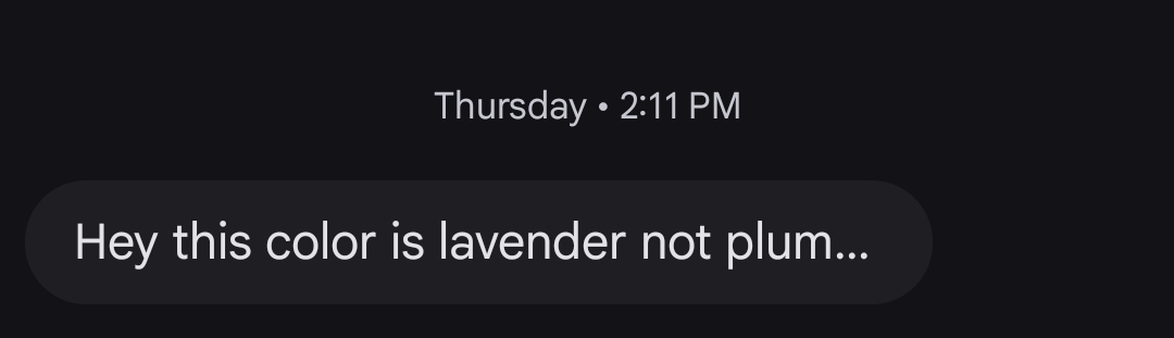
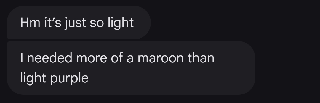
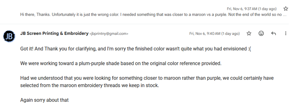
After production, the customer described the finished embroidery as lavender and light pink, and later explained that the shade she had envisioned was closer to maroon. Those descriptions appeared after the thread had been selected and the embroidery completed; they were not the original color specifications.
Privacy note: Customer names, logos, email addresses, and identifying information have been removed or anonymized from the correspondence shown. This example is intended to explain the color-selection and production review process, not to identify or embarrass the customer.
This distinction matters. A Pantone reference, a manufacturer's actual thread color, and the words someone uses to describe a color are not interchangeable. A description of the finished result does not change which thread was used or what was originally requested before production.
An important example from this project illustrates exactly why. Madeira Polyneon offers a thread specifically named Plum, color 1720. However, the customer's original request included Pantone PMS 228 U, and when JB consulted Madeira for the closest available embroidery thread match to that Pantone reference, Madeira Polyneon 1831, Purple Pansy, was recommended.
This highlights an important distinction: requesting a color by its general name, specifying a Pantone reference, and selecting a particular manufacturer's thread number are three different approaches that may produce different results. Had the customer reviewed the available Madeira thread colors and specifically requested 1720 Plum, JB could have worked from that exact thread selection instead. Whether that shade would have matched the maroon color she later described is a separate consideration. The most reliable way to communicate a desired embroidery color is to identify and confirm the actual thread being used, rather than relying on a descriptive name or Pantone reference alone.
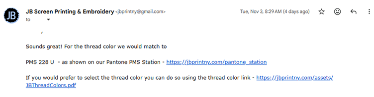
The customer's written response on November 3, 2026, at 8:35 AM was explicit: “PMS 228 U is great. Sounds great; I will wait for that. Thank you!” After receiving JB's option to select a specific color from the Madeira thread chart, the customer confirmed the Pantone reference as the basis for matching. This did not identify Madeira 1720 Plum, or any other specific physical thread number, as the requested selection; nor did it amount to an in-person approval of the finished thread shade.

For this project, JB offered the customer the opportunity to visit our showroom, where thousands of embroidery thread spool colors are available to review in person. The customer was comfortable working remotely and declined the showroom visit. This is precisely why we encourage customers to review available physical thread colors and confirm the selected manufacturer and thread number before production whenever a particular shade is especially important. To assist with this process, we provide a Madeira thread color reference (PDF) featuring the thread colors we use.
When precise color matching matters, we also encourage customers to use Madeira USA's Pantone Color Match system or consult directly with a Madeira representative to evaluate available thread-color options. This is the same manufacturer-guided approach JB follows when evaluating Pantone references. For transparency and preparation, we believe customers should familiarize themselves with this process, understand that an exact Pantone match may not exist in embroidery thread, and confirm their preferred physical thread color before production.
The takeaway is simple: a color name communicates an expectation, a Pantone number provides a reference, but a confirmed embroidery thread number identifies the material that will actually be used in production.
3. How to Select Your Embroidery Thread Color
At JB Screen Printing & Embroidery, customers can take several steps to make an informed selection before production.
Provide your Pantone reference.
If your company maintains brand guidelines, include the applicable Pantone number and color specification with your artwork.
Review available embroidery thread colors.
Our team can assist in identifying available thread options based on your reference and the manufacturer's color information.
Visit our shop to examine physical thread colors.
Customers who prefer to review colors in person can arrange an appointment to examine available embroidery thread options.
Request a physical thread sample.
If visiting isn't convenient, ask about having an available thread-color sample mailed to you for review.
Request an embroidered sample when appropriate.
For projects requiring closer visual confirmation, discuss sample production with our team before approving the full order. Sample availability, costs, and turnaround are determined by the project.
Confirm your final selection in writing.
Once your preferred thread color has been selected, verify the thread manufacturer and color number before authorizing production.
These steps help create a clear record of the selected color and reduce uncertainty.
4. Why Photographs and Computer Screens Aren't Always Reliable
The appearance of embroidery thread can vary across different devices and viewing environments.
A photograph viewed on a smartphone may display a different shade from the same photograph viewed on a desktop monitor.
Lighting, camera settings, garment color, and the reflective properties of embroidery thread can also affect perceived color.
For these reasons, photographic references and digital mockups should not be treated as substitutes for physical color review when precise shade selection is critical.
5. The Importance of Customer Approval
Before production begins, customers should review the specifications associated with their order, including the selected thread colors.
If a particular shade is critical to your project, please communicate that requirement before production approval.
Once a color is approved and production begins, changing the thread selection may require additional production work and associated charges.
A little additional attention during the approval process can help avoid unnecessary costs and disappointment after the order has been completed.
Let Us Help You Choose the Right Color
At JB Screen Printing & Embroidery, our goal is to make the embroidery process clear, professional, and predictable.
Whether you're ordering corporate apparel, uniforms, accessories, or specialty garments, we're happy to help you understand your available thread-color options.
If you have a specific color in mind, share your artwork, Pantone reference, and project details with our team.
And if you're uncertain about a particular shade, let us know before production begins.
The best time to make a color adjustment is before the first stitch is sewn.
JB Screen Printing & Embroidery — New York City Custom Embroidery Services